The Power of Your Color Choices

Color has a powerful impact on our lives, from the clothes we wear, to the paint we use on our walls, to the artwork we hang on those walls, color affects how we react to what we see.

As a graphic designer most of what is provided in this post is from the perspective of that background. Other creative people – like visual artists and crafters can also gain insights into how the colors they choose can effect their audience, if not how they approach the work itself.

By Definition: Color: noun. the quality of an object or substance with respect to light reflected by the object, usually determined visually by measurement of hue, saturation, and brightness of the reflected light; saturation or chroma; hue. [Dictionary.comwww.dictionary.com]

Color Choices

Color Meanings

Color psychology affects our lives in so many ways, yet we often don’t realize the impact of the color choices on our daily lives from stationery and packaging, on a website, in a retail store or office, in marketing and even clothing. Understanding color meanings is essential when you are choosing for a design project, especially in business.

The Power of Color

Every color and every shade creates associations and has a personality. Color has always had a huge impact on how people react to a product. Color has a powerful subconscious effect on every part of our lives, without even saying a word; an understanding of color meanings gives us an invaluable tool to get the best response to our efforts and ultimately to create a winning result.

Color Wheel

The Basics of a Color Wheel

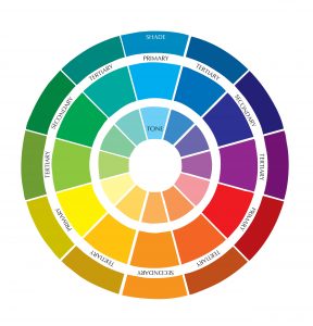
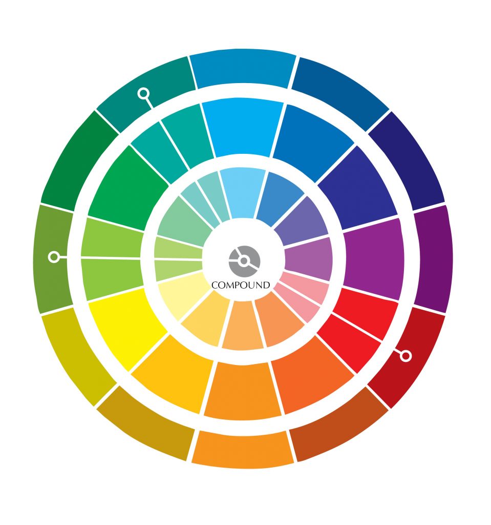
Before we get to the specific colors, a condensed and possibly, over simplified description of the color wheel and some terminology on the subject.  Most color theory, and color psychology use this model.

In general, primary colors are red – yellow – blue. They can not be mixed or formed by any combination of other colors. In some mediums, these three colors make all the other colors. They are also used to create the secondary colors.

Secondary colors are purple, green, and orange. They are created using two of the primary colors. To be specific: red + blue = purple / blue + yellow = green / red + yellow = orange

Tertiary colors take secondary colors one step further. They are the “two-name” colors, such as red-purple, red-orange, yellow-green, etc. The main color is stronger than the mixer – creating something closer to the primary color.

Primary, secondary, and tertiary colors, without the addition of white, black, or a third color, are pure (or saturated) colors. They are intense, bright, cheery, and untainted colors.

Add white to any pure color, to create a tint. These colors are also called pastels. They are lighter than a pure color, and not as intense. When black is added to a pure color, it creates a shade. When gray (black + white) is added to a pure color, the color becomes a tone. Blues and greens are cool colors and the warm colors are the yellows and reds.

Color Wheel 1
Triadic
Color Wheel 3

Combining Colors

Monochromatic color schemes come from a single base hue and extended using its shades, tones and tints. Analogous color schemes are created by using colors that are next to each other on the color wheel. Complementary schemes are created by combining colors from opposite sides of the color wheel. Triadic schemes are made up of hues equally spaced around color wheel. Compound schemes are similar to complementary schemes. Instead of using colors that are opposites, it uses colors on both sides of the opposite hue.

We’ve just brushed up on the basics of the color wheel with primary, secondary, and tertiary colors, plus the tints, shades, and tones, but it is plenty for the information that follows.  

Identify The Character of your Project

By identifying the characteristics of the project, you can find the color that expresses what you’re after. In business, remember that all the designs for your brand will be affected by the logo color. It will dictate the backgrounds, elements and even business cards. Be aware of just how the importance of the logo color is as your customer’s first impression of your brand.

Choosing the Right Color(s)

In applying the information about color meanings to enhance your project, don’t use any color entirely on its own; often a complementary color with your main choice creates a dynamic combination. And over-use of any one color can negate its effect and in fact have the opposite affect.

There is almost always more than one option of color combinations to assist your design, so you don’t have to choose any color that does not resonate. Or you may use a  less-liked color in a very small amount to get the right response.

Colors - One at a Time

Red

Red is a vivid color which calls for action to be taken. Its high energy and strength draws attention to itself and demands to be noticed. Red creates excitement, it is bold and passionate. It also can denote danger, rebellion and anger.

Magenta

Magenta is a practical yet spiritual color. Compassionate and kind, it encourages a balanced outlook based on common sense. It is also the ‘M’ in ‘CMYK’ in the print industry.

Pink

Pink inspires compassion and nurturing. It is a non-threatening color, delicate and gentle

Yellow

Yellow is illuminating, optimistic and uplifting color which stimulates our analytical processes and assists with mental clarity. It is a very intense color, but it isn’t easy to see against white. It is also the ‘Y’ in ‘CMYK’ for print.

Gold

Gold is associated with value, luxury and prestige. It reflects wisdom, beauty and generosity.

Orange

Orange is friendly and cheerful, a color which inspires confidence, creativity, and is optimistic, creates enthusiasm, sociable and suggests afford-ability. It also suggests caution

Green

Green is associated with nature, growth, health and healing. Green is a peaceful color, earthy and organic, it signifies renewal. It balances the emotions and inspires compassion. Green is also linked to inexperience and jealousy.

Turquoise

Turquoise balances and recharges the emotions and inspires good communication skills and self-expression.

Cyan

Similar in it’s impact to the other members of the blue family, cyan is the ink used in printng and the ‘C’ in CMYK.

Blue

Blue is the safest color, implying honesty, trust and dependability. It carries an association of wisdom, truth, and loyalty. On the cool side of the wheel, blue is considered restful and calming.

Indigo

Indigo is a powerful and strong color which conveys integrity and sincerity. It is associated with structure and rituals.

Purple

Purple implies wealth, quality, fantasy and creativity. It works well with many other colors. Purple utilizes both red and blue a balance between stimulation and serenity that may encourage creativity.

Brown

Brown is a strong, reassuring color that is comforting and reliable. It relates well to businesses that promote down-to-earth and outdoor products and activities.

Black

Black is the color of power and authority and in excess it can be intimidating and unfriendly. it is also the easiest to read.

White

White is a blank canvas and implies efficiency, simplicity, fairness and order.

Grey

Gray is neutral and conservative but does imply security and reliability. It creates a great background for other colors. It is a very popular color for corporate logos, but it is also the least popular color and many people find it dull and somber.

Silver

Silver is a modern sophisticated color, calming yet uplifting, with a degree of mystery about it. 

The Power of Color Choices

This color chart offers a quick reference for the emotions most widely associated with these colors. The context around the color, and even surrounding colors, can have an effect on responses and meanings. Also, there are cultural differences and certain shades or tones may result in very different effect and symbolize different things for different people.

To get an 8.5″ x 11″ PDF of the Color Info-graphic (above) with a second page of nine more colors, register for our email notices. 

If you’d like to know more about color theory, then there are lots of additional sources out there that cover the topic in more depth. we hope these basic concepts spark your creativity to explore the impact and emotion of color in your work. Comment below to add what the colors mean to you.

Send a Comment