Graphic Design, Photography, Visual Artist…. all creative things!
Creative Ways to Use Stock Images
There are many effective ways to use stock photos and images to get the most from your choices. This post is the first in a series to suggest options to personalize the images you choose whether they are purchased, free or your own.
Expand your creativity in your designs and art with examples of the variety of images available in the LKArts shop and see how they can be combined to create something totally different than the original photo(s).
At LKArts, we strive to offer stock images that spark your creativity! Assets that don’t look like they came from a stock website and can be used again and again with completely unique results for your brand and marketing efforts. Discover the real world backgrounds, textures and props that will enhance and accelerate your brand recognition on social media, digital and print projects.
By limiting the number of images used, we can explore ways to be more aware of the possibilities when choosing the images to purchase and be more flexible when approaching your next project.
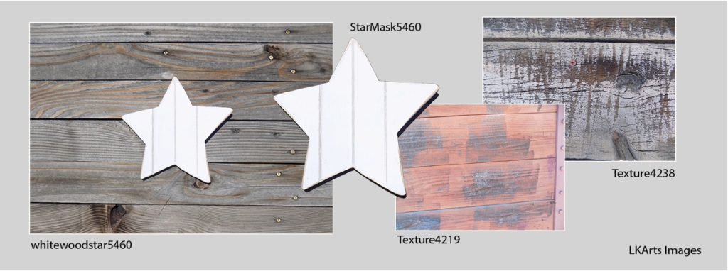
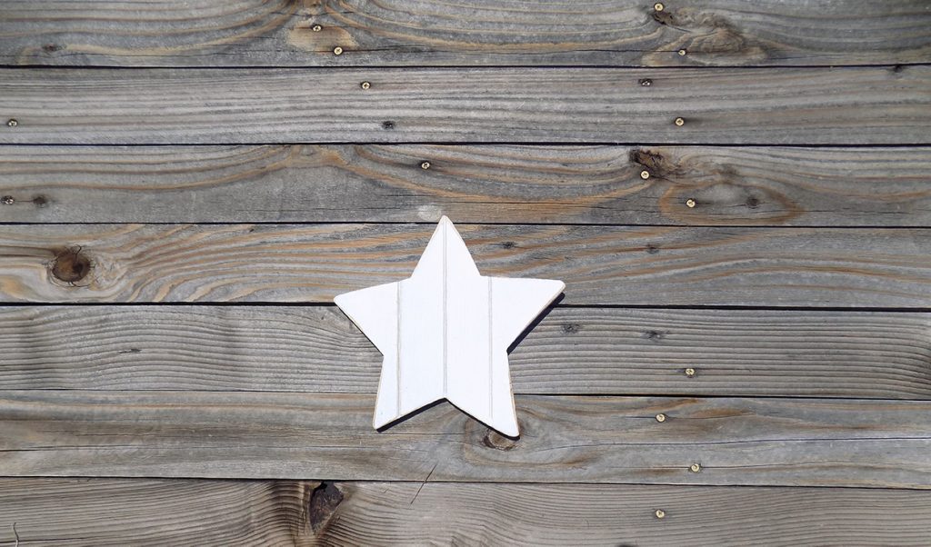
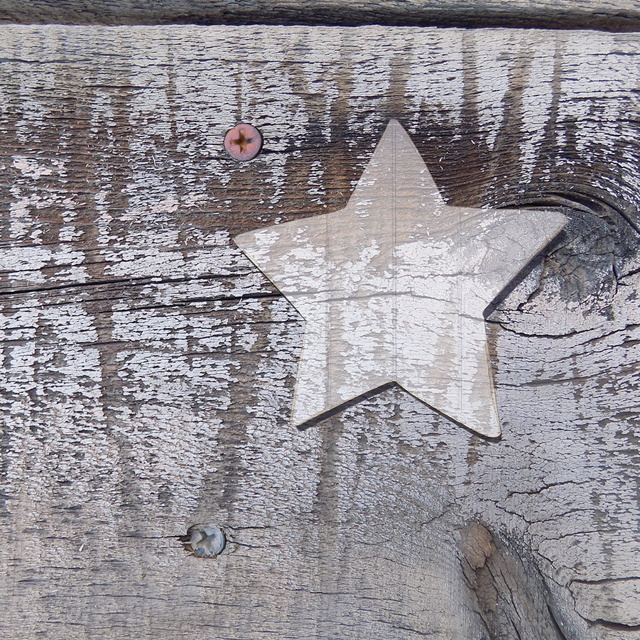
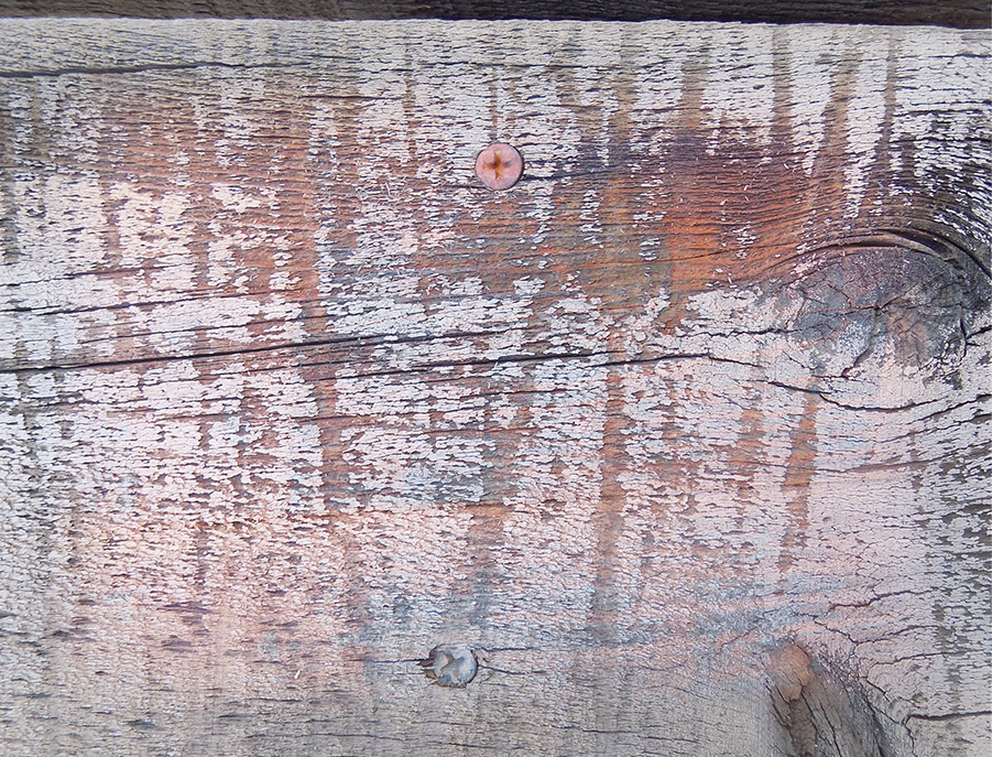
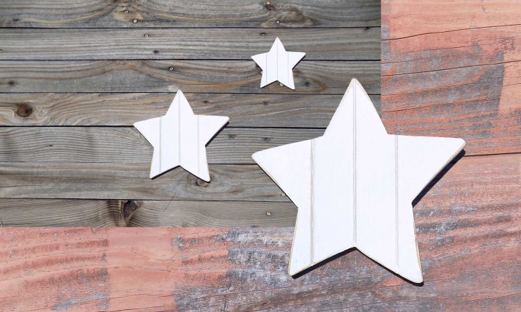
Let’s start by choosing three photos, all available in our shop. The star #5640 is pictured on wood fence boards with the slats running horizontally. This photo also comes with the Star as a .png, so the star can be added to other background or images. Photo #4219 is also a fence photo with unique colors and texture. The third choice is photo #4238 offers another fence close up with even more texture.
The 4 elements used in this demonstration are available as a package Here
Easy Adjustments using one image
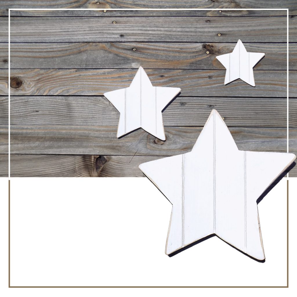
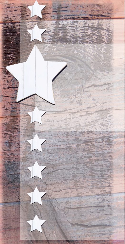
This Instagram post started with just one asset from the Creative Sparks collection, photo #5460 . With a simple crop, repeat of the star, and adding a border, the inspirational message is eye catching and memorable. The middle size star is actually a part of the base photo.
The lead picture in this post uses similar techniques… it changes the asset by a slight adjustment in positioning the stars and adds another background, but no border or text.
Two images double the possibilities
The three examples shown above each use 2 of the images we started with.
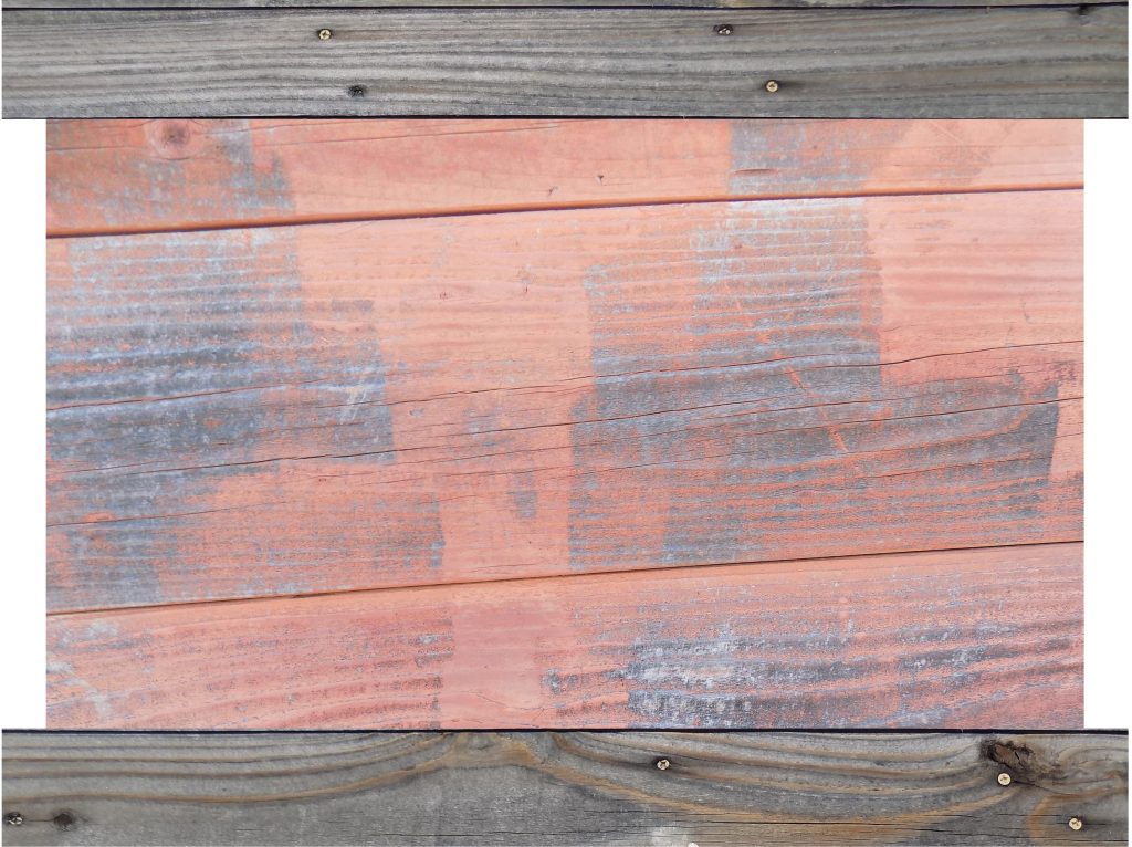
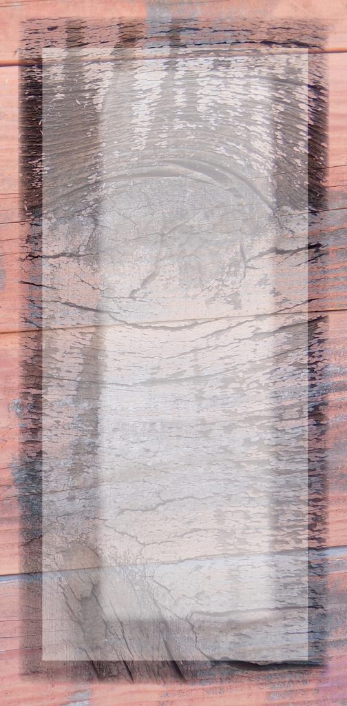
First one is creatively cropping two of the fence pictures, using single boards of one fence to frame the other. No other techniques were employed, so this can be done in most design applications.
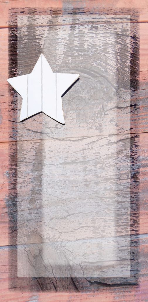
In the middle image the star’s opacity is lowered so you can see the texture through the star. Great background to add a favorite quote for social media!
The third image adds a twist with transparency just by changing the blending mode from screen to multiply. In this example a basic feather was added to Texture #4238 to soften the transition between the layers.
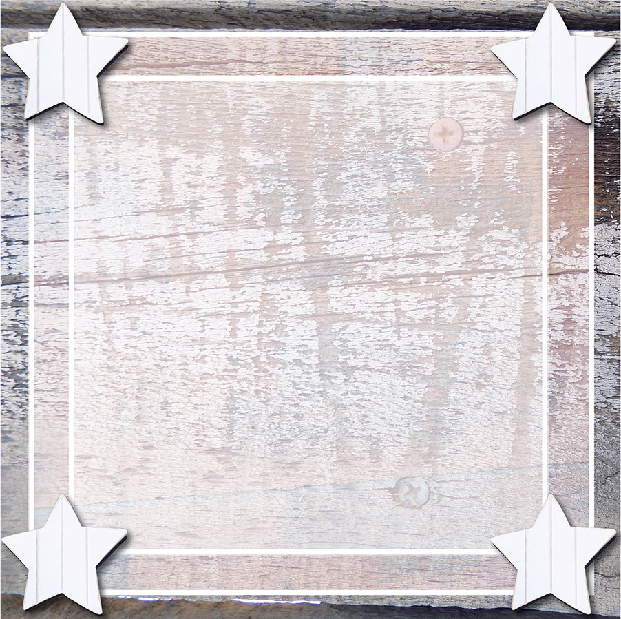
Stack three files for drama
Using the same elements for an Instagram post, changing the size of the texture files, order of the layers, the amount of transparency creates a different option but keeps the style.
These examples have 2 different layers of a transparent white. Notice how moving the transparent white layers into different locations adds interest but keeps a visual continuity.
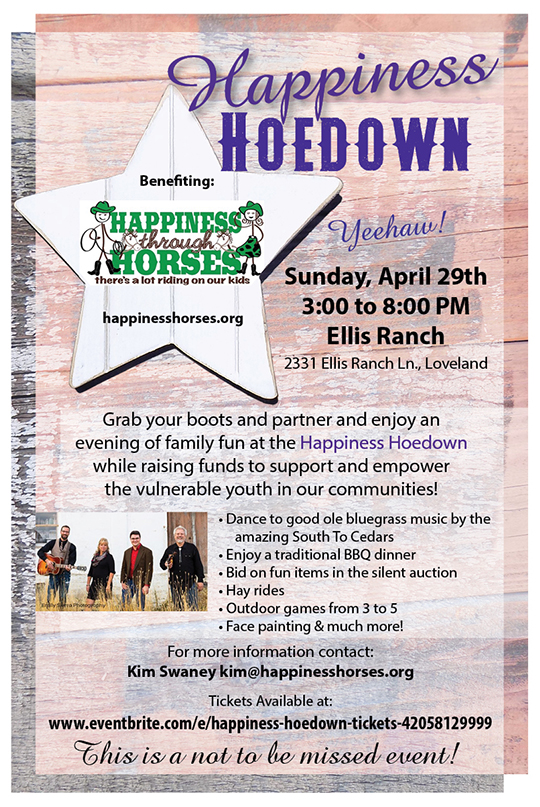
Real World Graphic Design: Happiness Through Horses
Happiness Through Horses is a non-profit that empowers vulnerable youth in the local community. The ‘Happiness Hoedown’ flyer was created several years ago to promote a fund-raiser that would provide scholarships to their camps. The details of the project are provided for reference. (They – HTH – have since updated their logo, and now have a permanent home – Happiness Ranch offering more opportunities.)
The HTH project used the same 3 assets to create the flyer. The flyer was designed to print 2 at a time on letter size paper, and cut in half, making the final size 5 1/2″ x 8 1/2.”
Background #4219 is the bottom layer, with texture #4238 as the next layer up, set at a 90% screen transparency effect to achieve the translucent composite.
The star asset #5460 was added for the purpose of drawing attention to the HTH logo. And a white box set to 50% transparency was included behind the smaller text to make sure it was easy to read.
Notice that both of the texture layers are cropped from the original pictures. And slightly offset to create a visual border.
Fonts used include: headline – Amazone, AdvenVintage and text – Myriad Pro Regular & Bold.
On proof the client requested the addition of purple for some of the text and this was accomplished by highlighting the event title. The original 2nd paragraph was changed to a ‘bullet list’ for an easier read.
Choose Your Assets Wisely
This all demonstrates that if you choose stock wisely, with colors, textures and assets that compliment your brand, you can imagine many uses for your choices.
All of the options used for these examples were created in Adobe CC, InDesign, but could easily be accomplished in many other applications.
I highly recommend that you experiment with the tools available in whatever software program you are using.
Exploring the options available to you and seeing what effects you can apply is a great way to spark your creativity and get the most use from your stock images. The files used here are available in the LKArts shop, just click here.
I do use assets downloaded from other stock websites, both free and purchased. I credit those assets when possible.