This post focuses on getting the most use from test photographs, by turning practice pictures into social media assets. Whether the pictures are from your phone or a camera – or picture downloaded from a stock site.
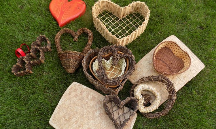
I often take a photo of a group of props, sometimes for reference, or cataloging, sometimes it is to see how things can work together, but I have discovered that these pictures can be put to good use by creative thinking and a little planning.
From this one original photo – which was taken to check the ambient lighting – I got over 17 images sized for social media and several combinations for Pinterest. With creative cropping, rotating and adding overlays, I produced a series of images that could be used over and over. And that’s getting the most from your stock images!a test photo
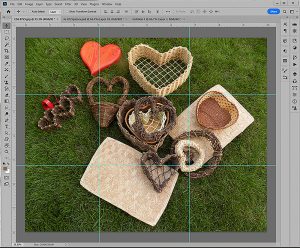
Crop the Test Photo
I started by making a grid to divide the image into thirds to get an idea of the images that could be cropped from the original. I kept in mind the email size I use and the social media sites I regularly post on and their sizes.
Now, there are a lot of options on how to find the sweet spots that are not only use-able and workable for your specific style, but also standout and are memorable to your audience. For me this changes with each picture, but on this one, here’s how I proceeded.
Size For Social Media
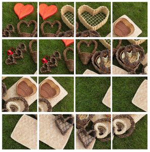
My next step was to make a file that fits Instagram’s optimum size in Photoshop – my preferred software. But most imaging software will easily do this. Then I placed the original image at it’s full resolution, and repeated that until I had the 9 sections each on their own layer.
Since the image and the grid were not square and Instagram’s blocks are, I could shift each layer around until I got what might be a use-able image. Then I copied layers to further adjust the selections I had. This ended up to be the 16 images shown above.
Of course, I wasn’t done. Most of the images weren’t quite up to my designer’s standard, next up was to polish and plan which images I wanted and which could be discarded. ( But, for the purposes of this post they are all on file.)
Teaser Campaign
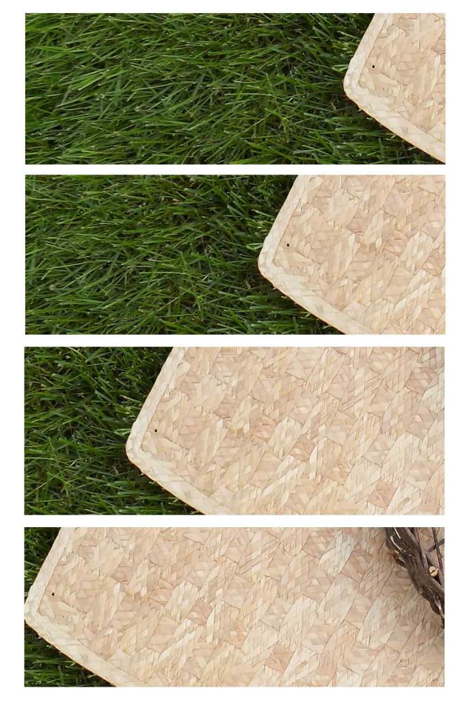
While I was working with the Instagram sized file, I knew I had the beginnings of a really good teaser campaign… Did you see it? By moving the original over in small steps it creates some anticipation of what’s coming.
Note: A teaser campaign is known in the industry as dishing out the information in small pieces adding to the campaign with each frame usually over a specific time period. And there should be some continuity in the images and text. [For more information on teaser campaigns click here.]
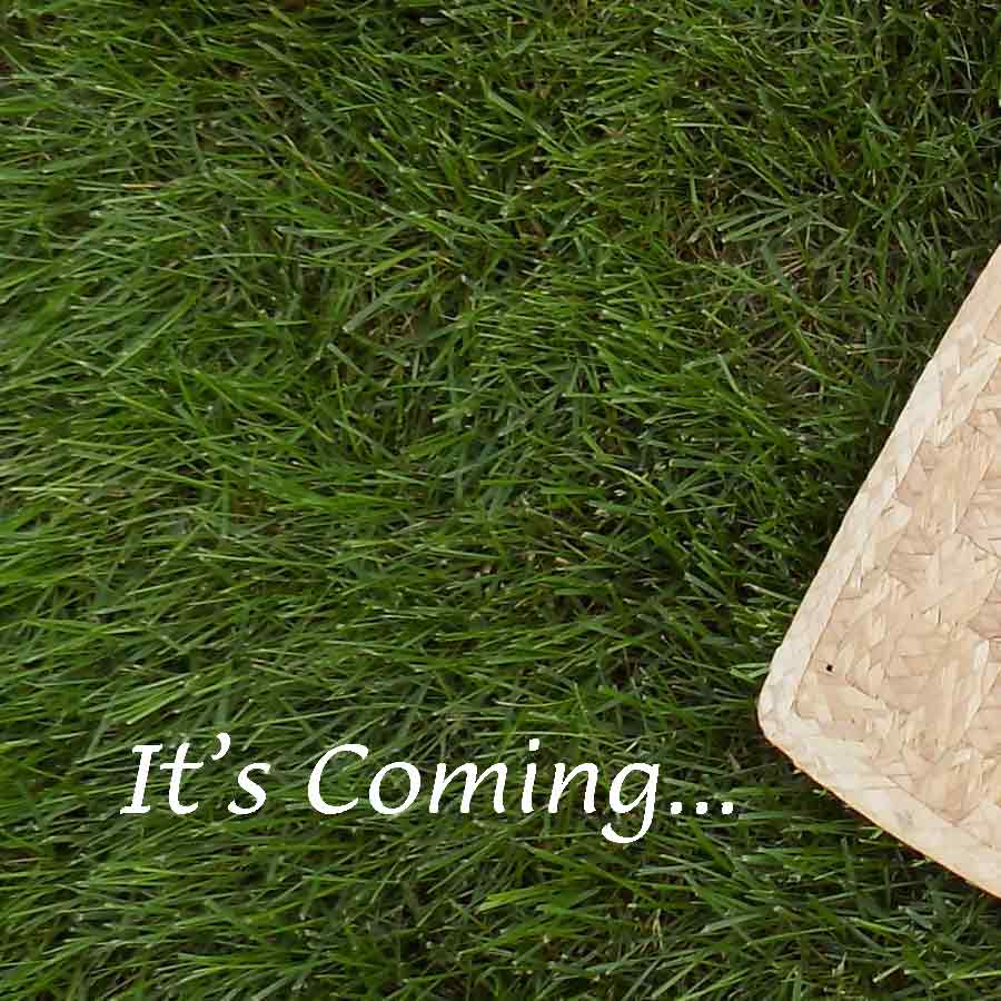
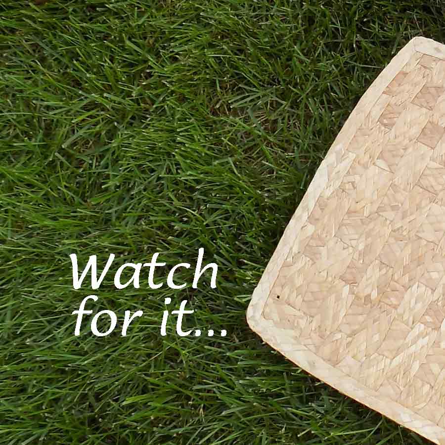
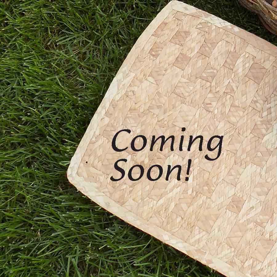
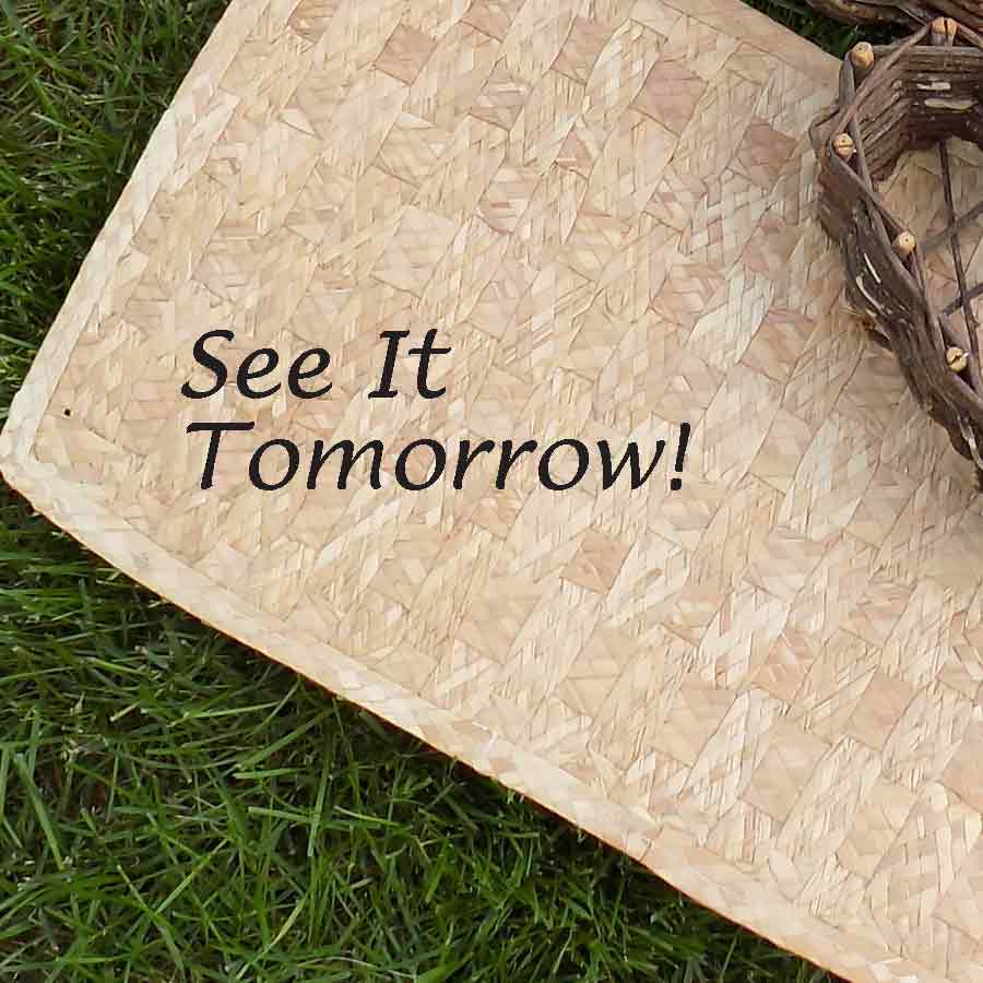

This series of images is well suited to a teaser campaign, with some added text to keep the audience watching. The wording could be more specific to whatever the promo is teasing, or it could be a count down. And this is just a start for the options of using a ‘throw-away’ image to jump start your creativity.
Add Graphics To Digital Assets
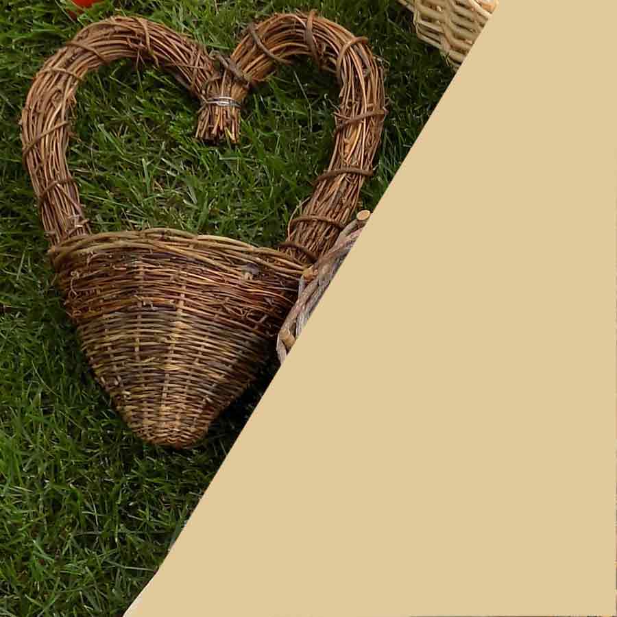
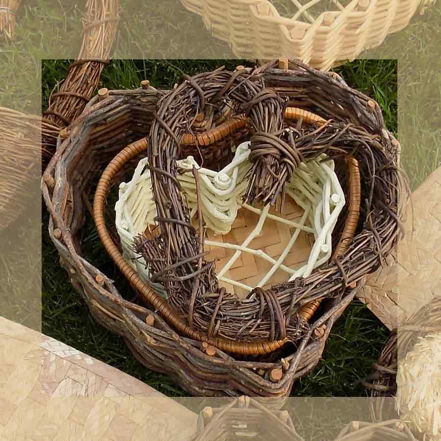
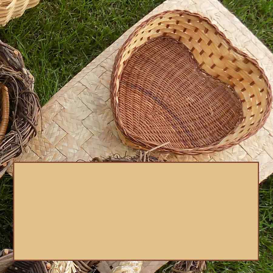
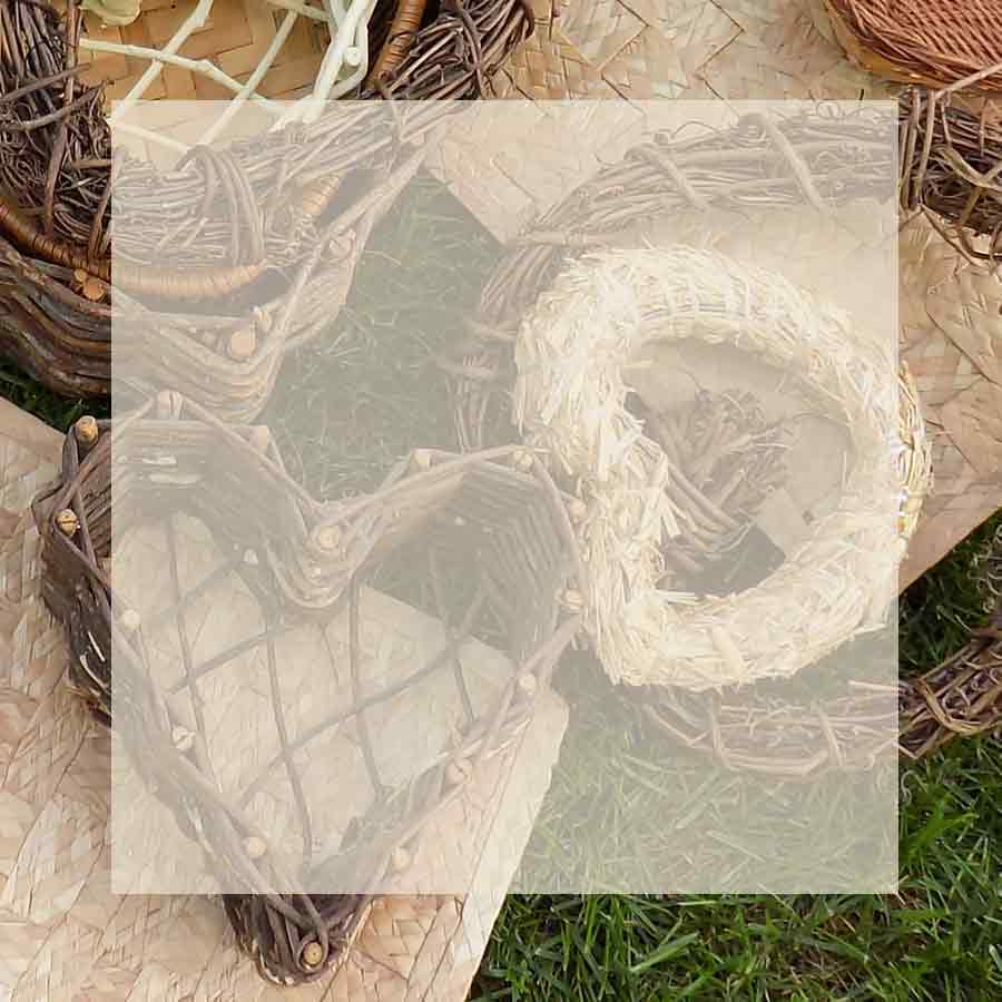
These all seemed too busy to be useful, until I started adding overlays. Solids and transparent, each has uses beyond fixing a too busy image. These are just a few of the ways to incorporate space for a message or logo. Even with adjustments, some of the trials and tests will not make the cut or ever be useful, but trying different techniques can help stretch your images.
Crop for Focus
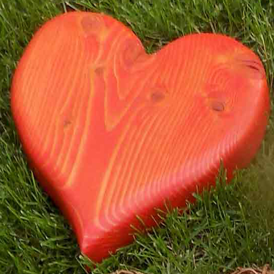

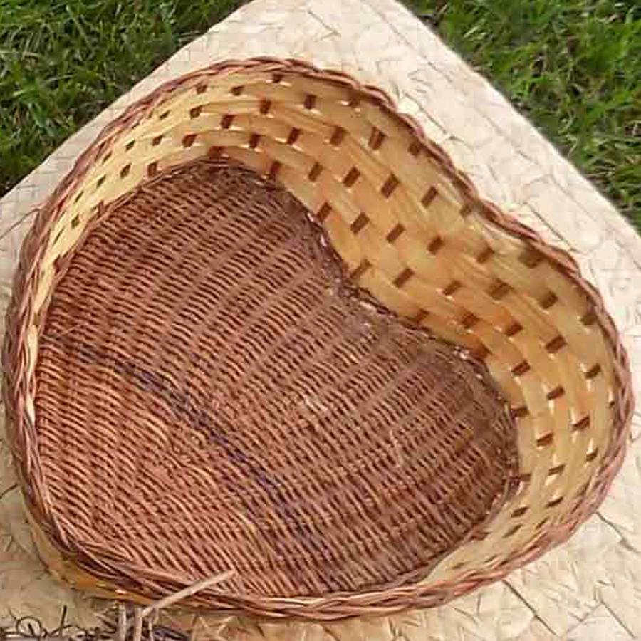
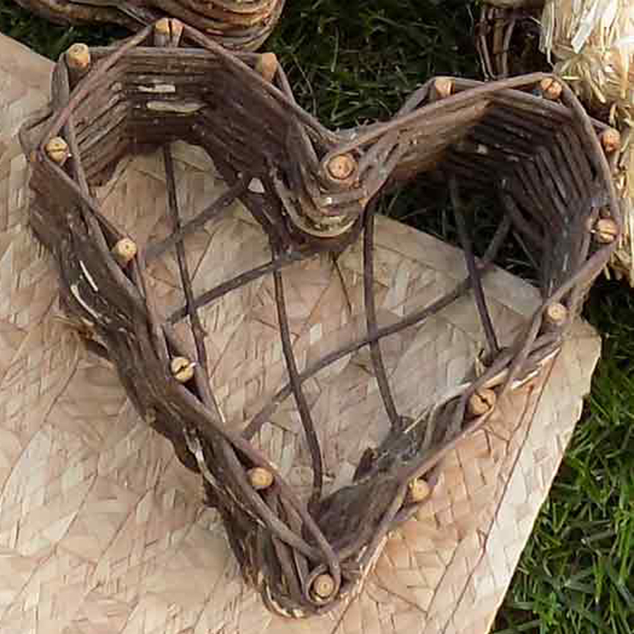
On these I have to admit they have been sized to crop out distractions, and not always in proportion. The ‘rule’ I’ve broken: Don’t enlarge raster files – but truth is: it sometimes can be ok, depending on the final output and how much bigger you need to go. Social Media is viewed on a screen and therefore a lower res file is needed, so these will look good even though I broke a design rule.
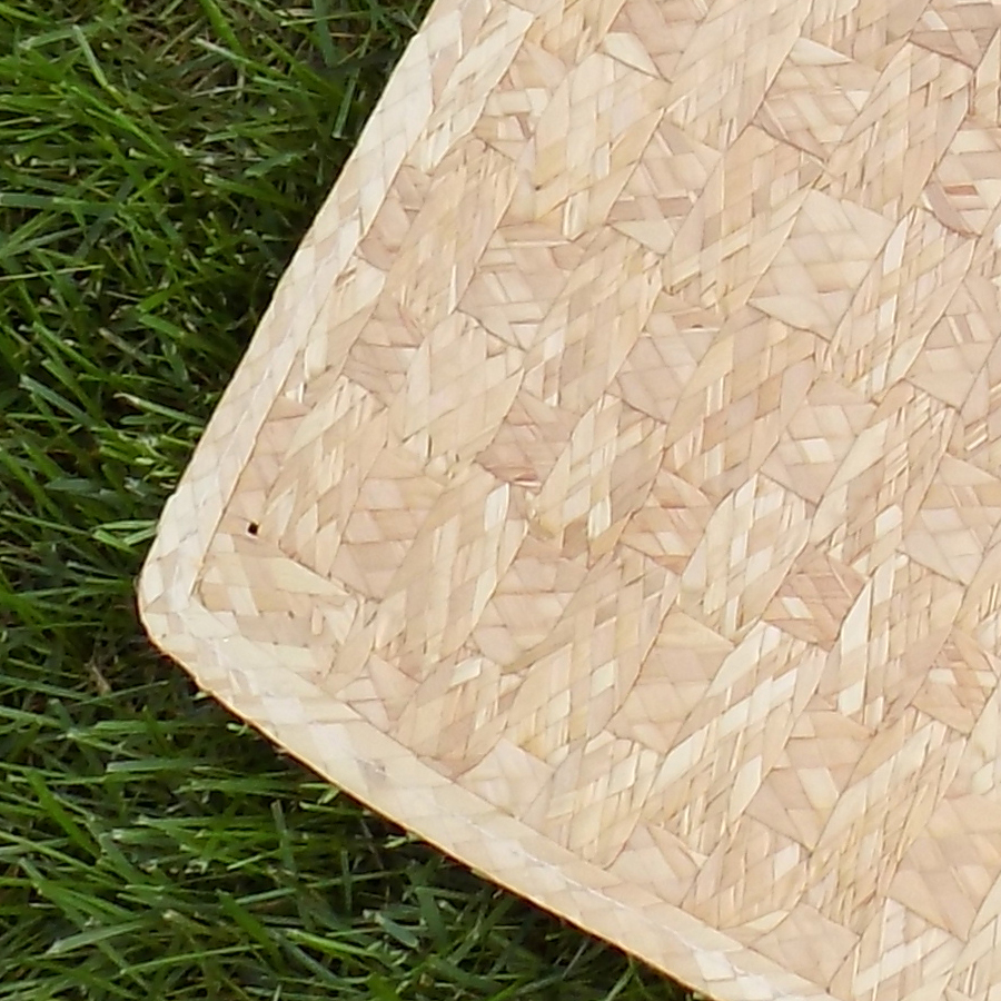
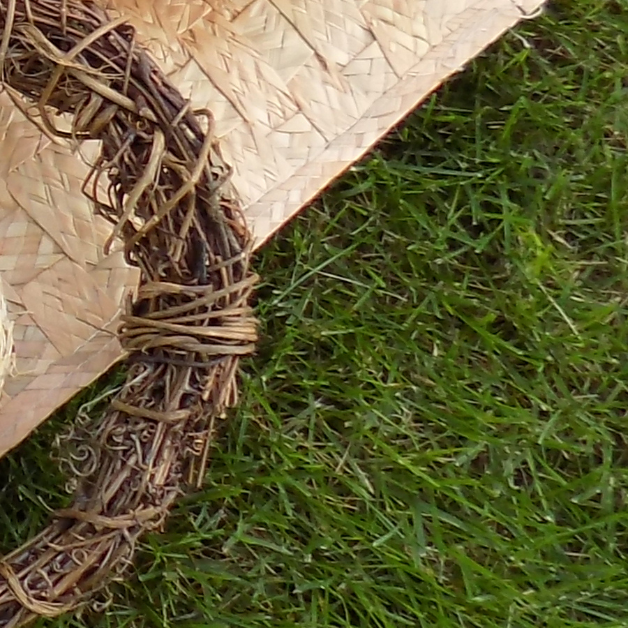
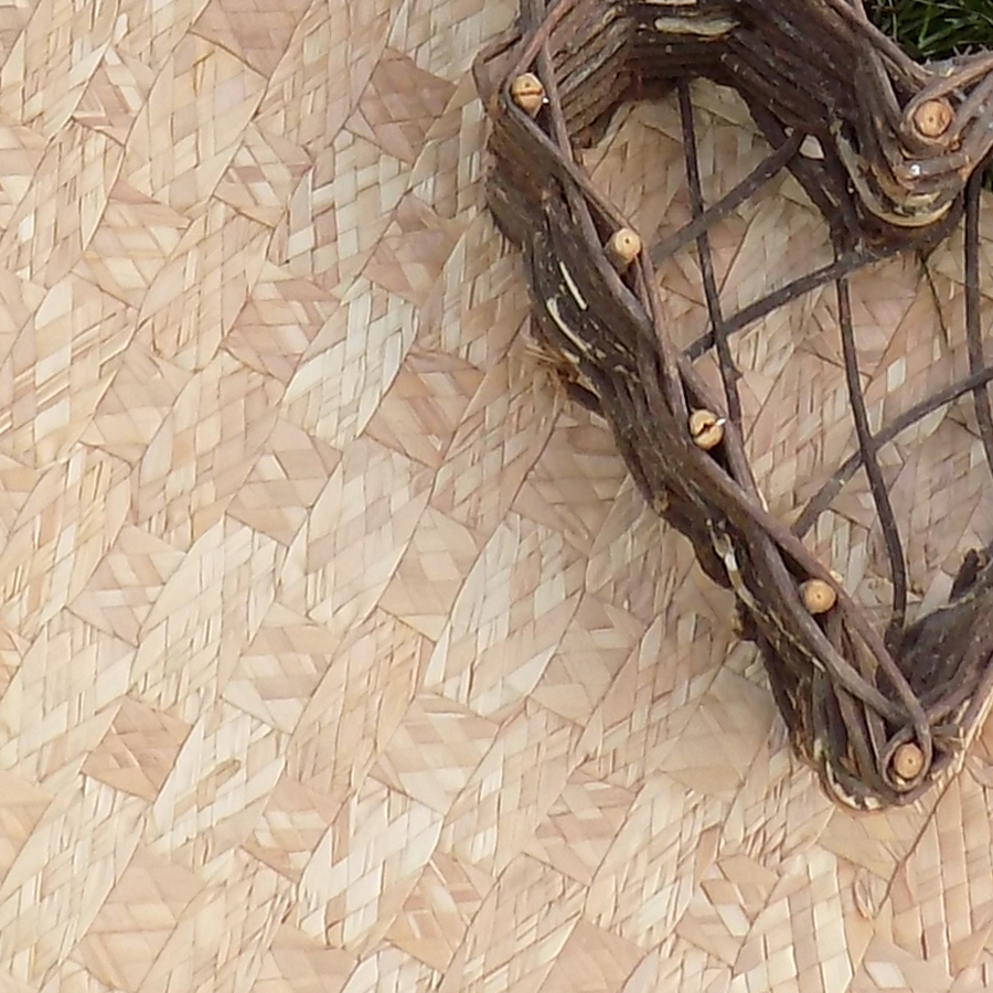
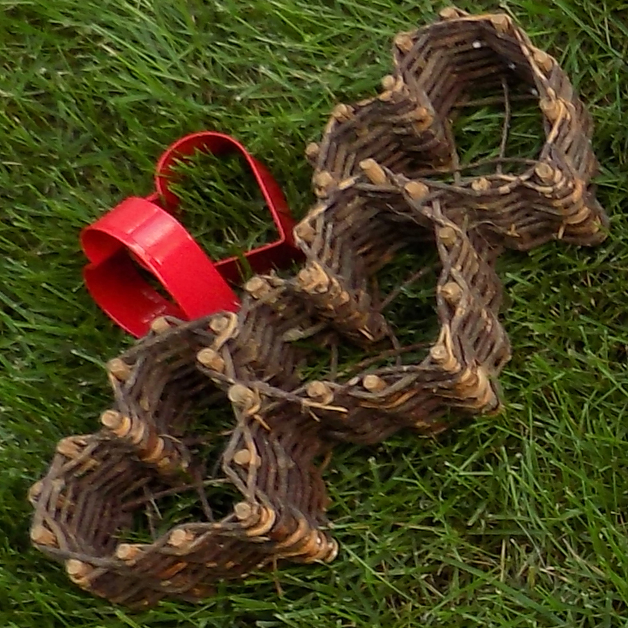
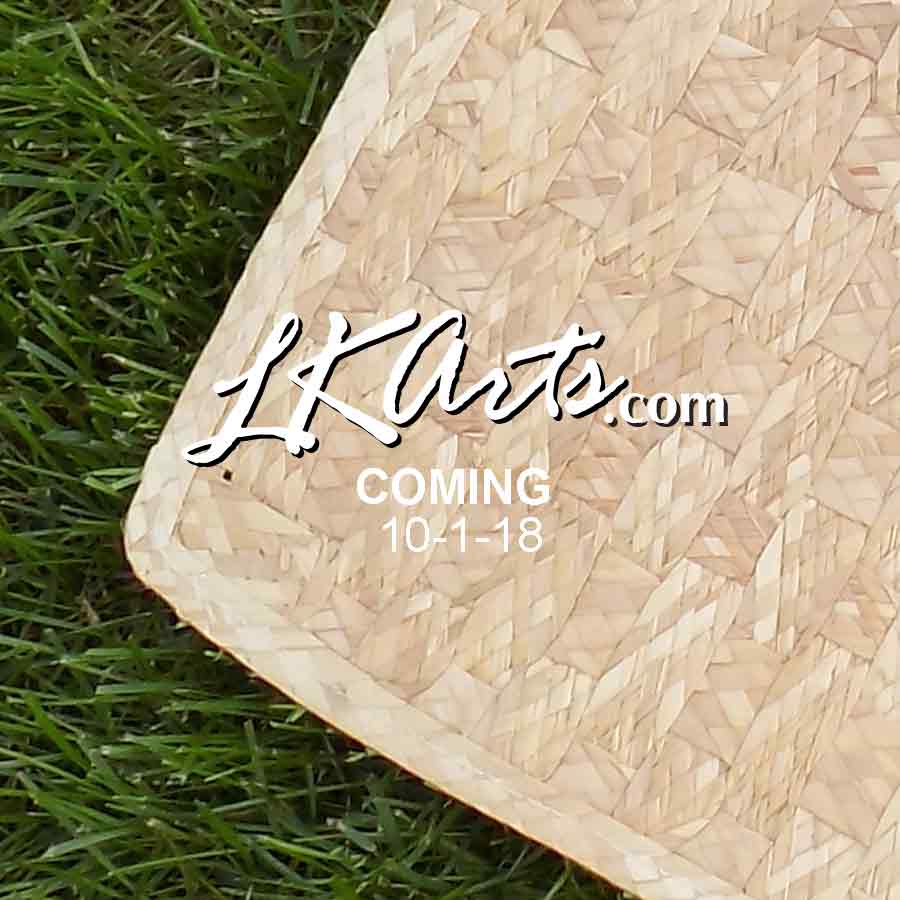

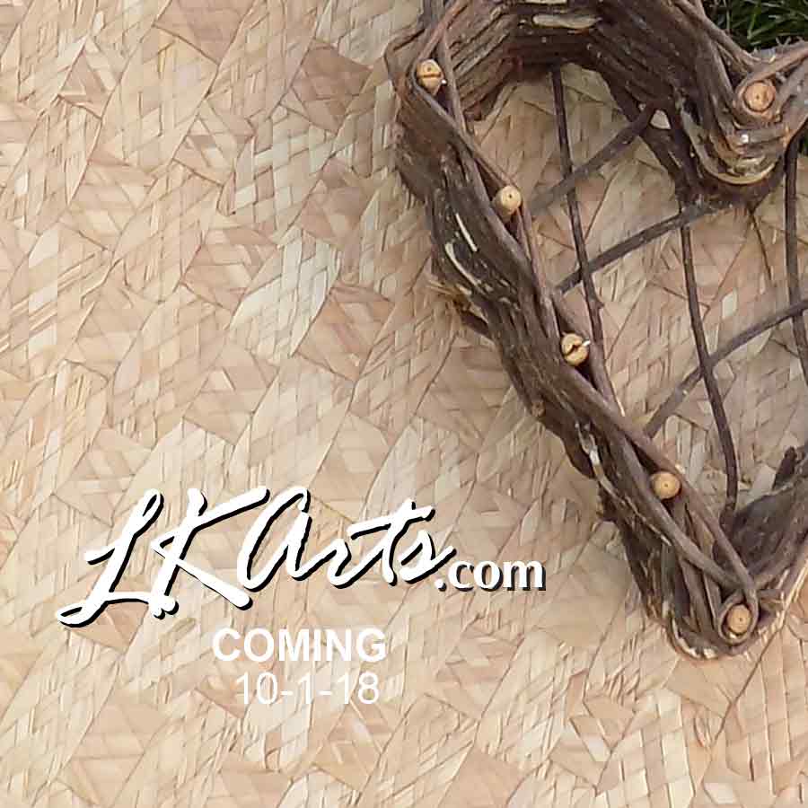

This post was originally conceived while setting up a launch of the LKArts website, and these were the images I used to announce the site you are now visiting. The website is designed to offer the creative community unique assets for artwork and crafting, with unusual images for backgrounds, props and textures. These images showed a variety of textures while still showing some consistency. It has expanded to included ready to print cards and posters with original photos and artworks. Browse the shop!
With Facebook and Instagram I can use the same set of images, while my blog and newsletter both are based on a wider format, and Pinterest goes vertical. This means when I am setting up any marketing campaigns I usually create all 3 sizes of the graphics at one time, mostly for consistency.
Your social media and emails should always support your marketing… The idea is to get traffic to your content, right?
Pinterest Samples
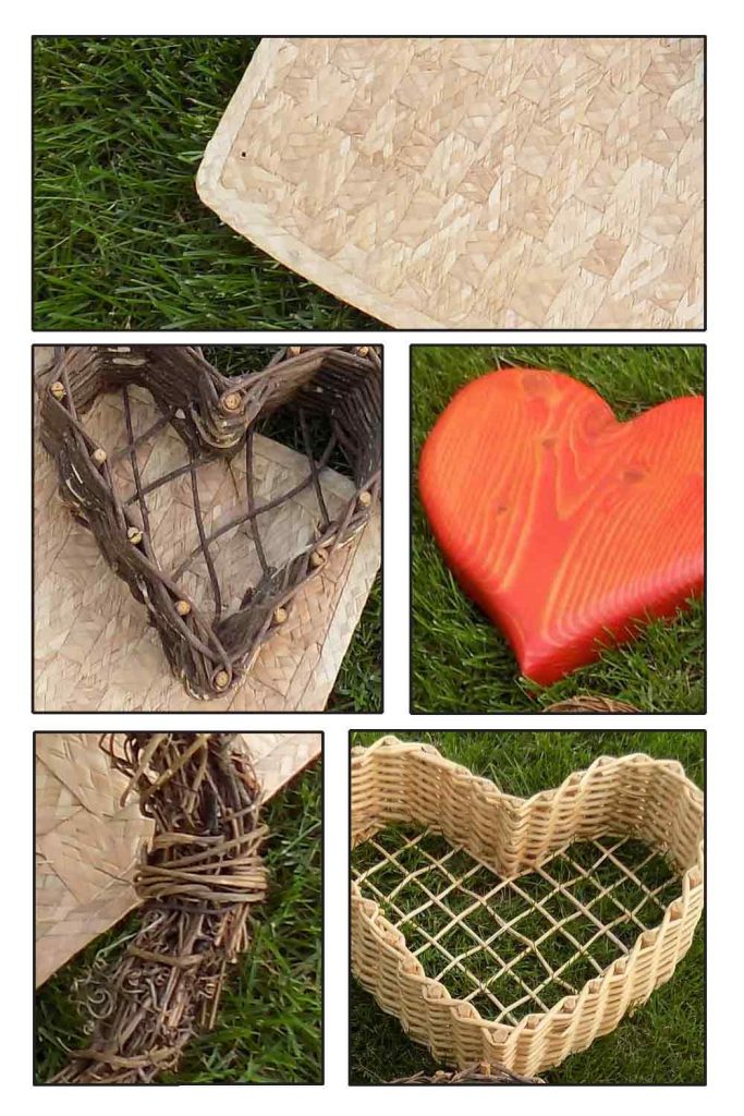
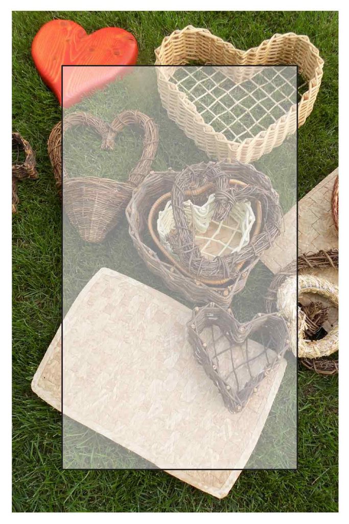
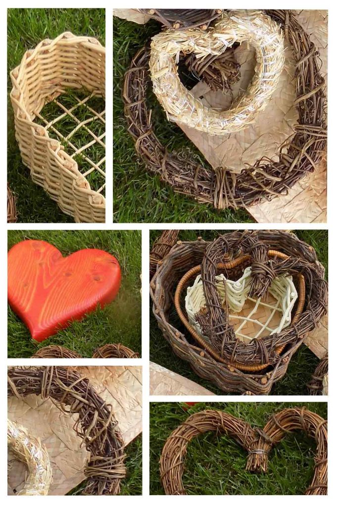
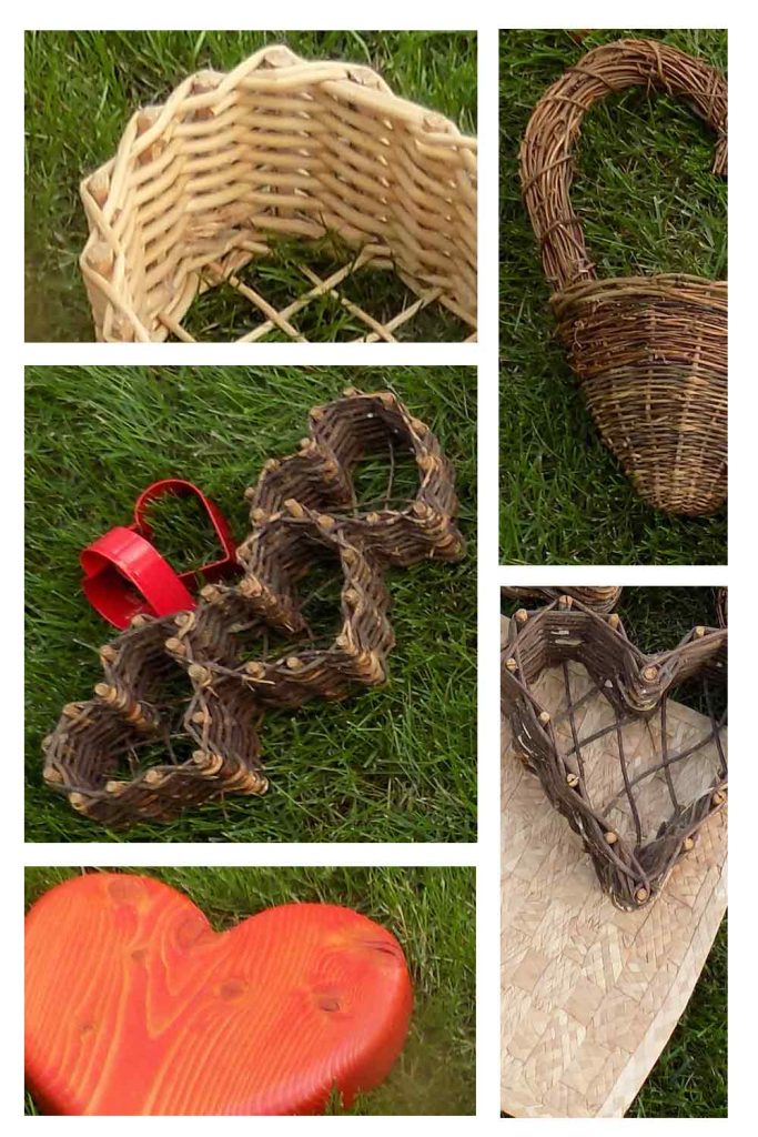
The same options and techniques apply to the images for any other social media content you are posting. Color blocks, transparency and creative cropping. Make sure to provide links where needed and keep fonts to a minimum.
To expand your graphic assets get creative with just one picture! The original photo is available in the grab bag product package. You can also get all the images (with no text) shown in this post here .
Be sure to read “Graphic Design Principles and Elements” for other ways to transform photos into Social Media Assets. And, check out “Creative Ways to use Stock Images” to get the most from your digital assets.
