Graphic Design, Photography, Visual Artist…. all creative things!
Graphic Design Principles and Elements Explained
Graphic Design differs from art in that it has a purpose or a message. In all graphic design combining design elements and using the right principles to create a visual representation of an idea can and will attract the right audience.
The principles and elements of design together represent a set of guidelines that graphic designers use to create aesthetically pleasing visuals.
The principles of design – Balance, Contrast, Repetition, Emphasis, Movement, Unity create an effective and attractive composition by using the elements of design – Line, Color, Shape, Space, Symmetry, Scale, Texture and Direction – to create a visual that conveys a message.
The elements of design are the components that a designer uses to create a project, and they represent the base of graphic design.
Both the principles and elements are guidelines – the basic rules… and rules can be broken, but they have been created for a reason.
“Learn the rules like a pro, so you can break them like an artist” ~ Pablo Picasso
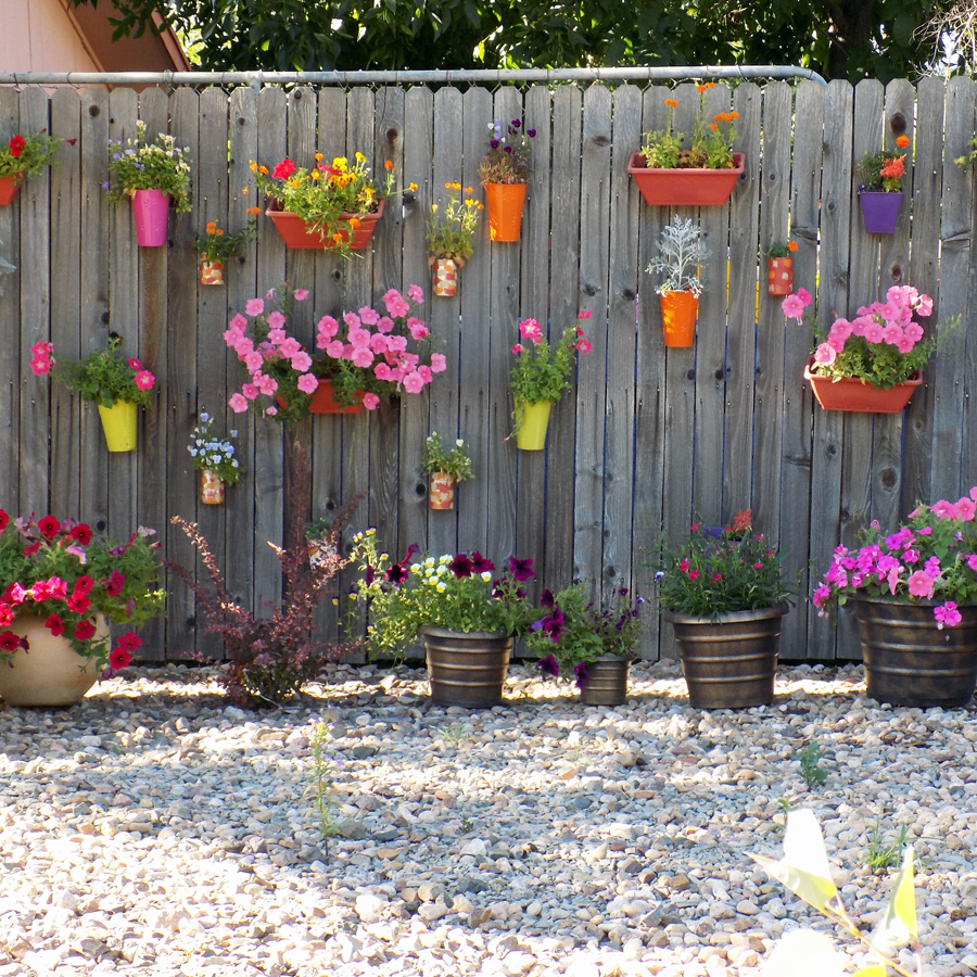
Balance: The visual weigh of each element in the design and how they relate to each other. Symmetrical balance is like a mirror image, and can be vertical or horizonal. Asymmetrical balance is even visual balance but elements are different in size shape and/or color.
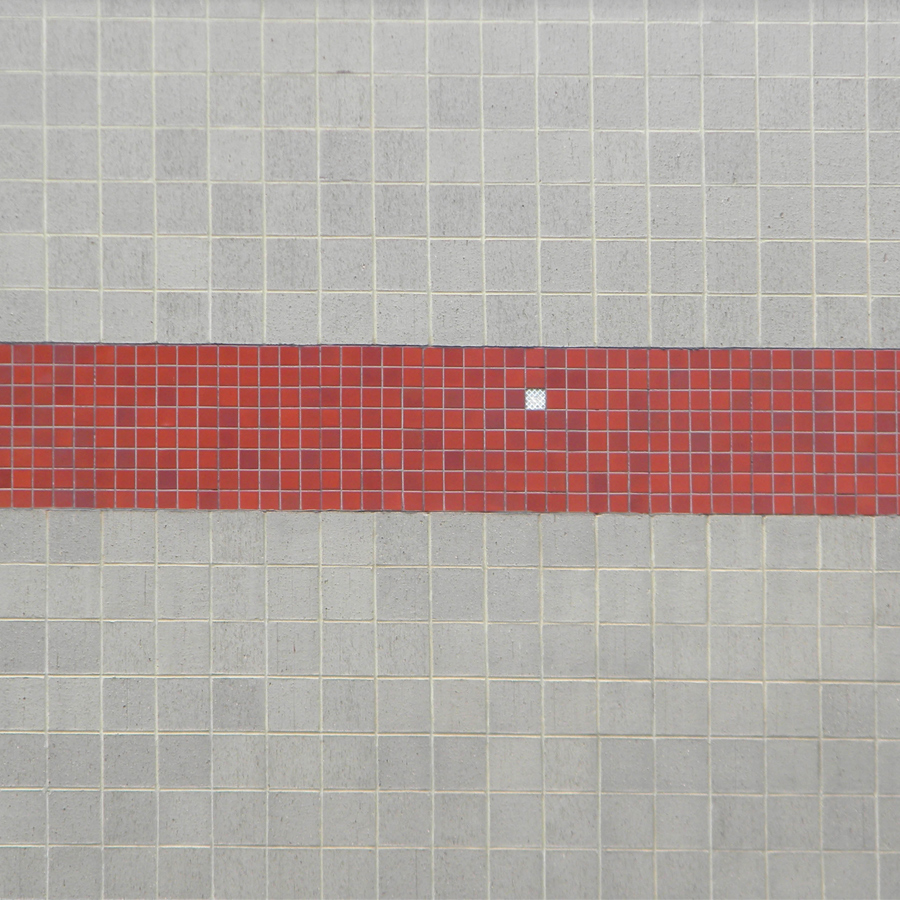
Contrast: Making one object more distinguishable than the other objects in the design to draw attention. Opposites on the color wheel create contrast, as well as the familiar black and white.
Repetition: Using the same or similar elements to create consistency and unity. All of the elements can be used effectively to infuse continuity when applied correctly. Patterns are a form of repetition and often used as backgrounds.
Emphasis: Special weight or significance. Focuses the observers’ attention on the most important part of the design. Often a call to action.
Movement: Elements placed in a way that produces or transmits visual motion. This effects the way the audience views the design. Most often we read left to right, so using that knowledge can direct the reader’s attention to where you want it to go.
Unity: Arrangement of elements in a way so that each contributes to the whole design. Marketing in general recommends unity across all platforms for audience recognition.
Line: Besides the obvious straight or curved, lines can describe a shape or create perspective. They can be thick or thin, vertical, horizontal, or diagonal. Lines are the most basic design element.
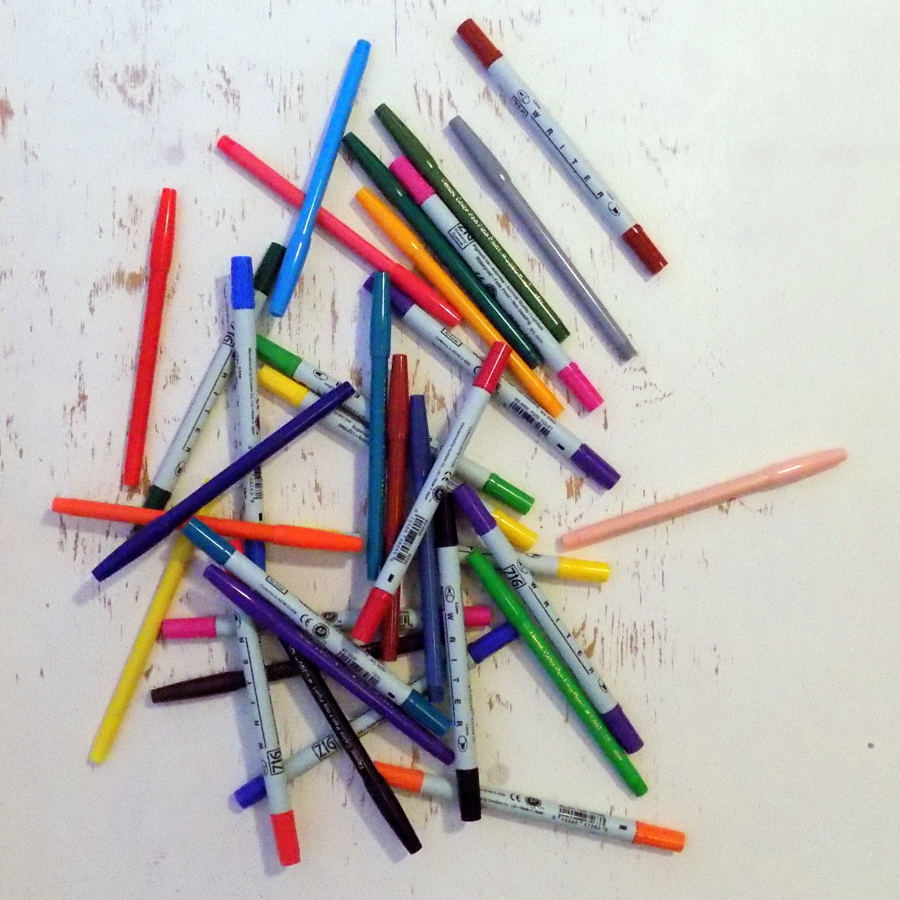
Color: As a design element, the right color can evoke certain emotions. (check out ‘The Impact and Emotion of Color’) Color properties include: hue; saturation; tint and shade.
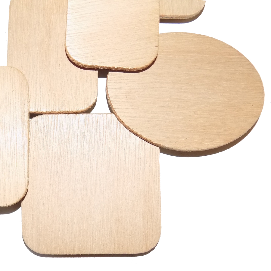
Shape: A form, something enclosed by boundaries. Includes but is not limited to: geometric, realistic and abstract. Repetiton of a shape can create unity.
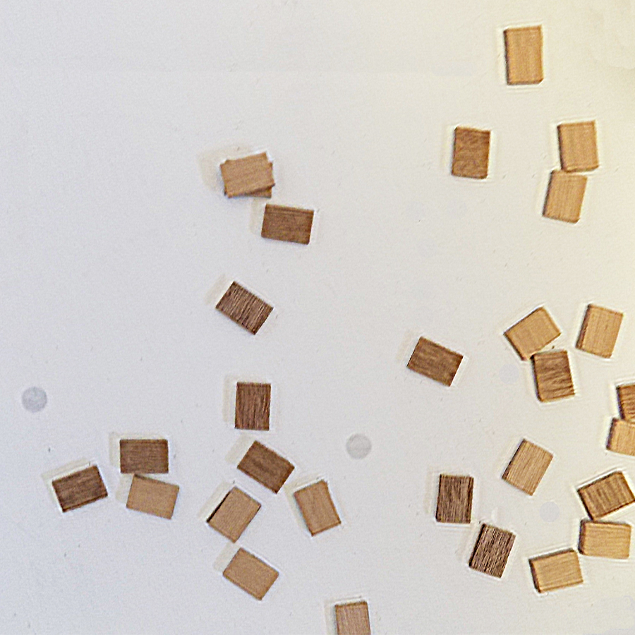
Space: In design terms this is an empty area – the space between or around objects. Also called white space or negative space. Space does not have to be white.
Symmetry: An arrangement characterized by balance and harmonious proportions. Often referred to as mirrored image.
Scale: The size of one element in relation to other elements in the design. Scale can be effective in directing a reader’s attention.
Texture: The surface look of a visual design. The visual representation of cloth, wood or other real world objects. Can create unity through effect choices.
Direction: Creates movement in a design. Correct placement of the elements can direct the audience to focus on the object of the project.
Rule of Thirds: A guideline which applies to the process of composing visual images such as designs, films, paintings, and photographs. Imagine the image as divided into nine equal parts by two equally spaced horizontal lines and two equally spaced vertical lines, and the important compositional elements are placed along these lines or their intersections. The technique creates a more dynamic composition and is more interesting than a centered subject.
Putting it all together
Some of these explanations may seem to be in conflict, but realize that they do not all need to be applied at the same time or with the same focus. Also, there are many similarities in how they work together visually.
To put this into practice, designers work first with the message and the audience, often starting with the amount of space they are working with. An letter size promotional brochure can hold a lot more individual elements than a 4”x 6” postcard.
The basics that need to be included are a headline, copy, a logo and usually a call to action. The other components change by the project. Collecting all the items that must be included can prevent major redesigns later in the process.
Knowing the both the company culture and the audience to whom the project is directed will help to determine the style of the design. If the project is advertising a rock and roll music venue the design would be very different than a project advertising a senior living community.
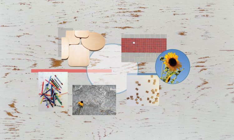
Did you notice? In several instances, the images that illustrate this post could have been used for more than one of the principles or elements. The balance photo also illustrates scale, the image for line could represent texture and even contrast. The picture depicting space could have been used to show movement. And there are more… what do you see?