
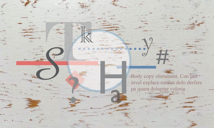
Typography is the art of arranging words in a clear, legible, and appealing manner, to relay a specific message to the audience. It involves choosing a typeface and specific fonts to elicit a response from the reader.
In typography, it is common to hear the terms ‘typeface’ and ‘font’ used interchangeably but there is a subtle difference.
Interestingly, in the research there were differing opinions on the exact definitions, but generally each typeface is a collection of characters or glyphs that share common design features.
These collections are usually comprised of an alphabet, upper and lower case letters; numbers, punctuation marks, and some symbols. Typefaces can be a single set or may include multiple sets with different attributes – like bold and italics that create a type family.
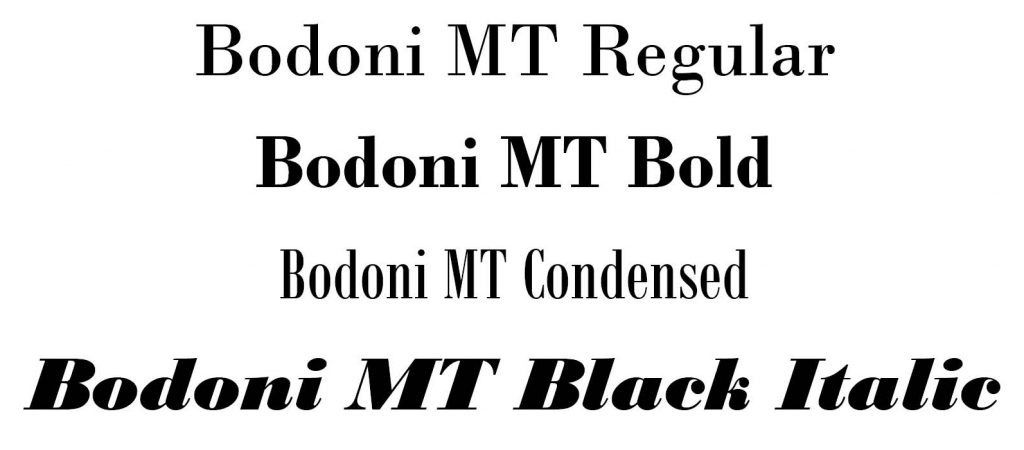
Traditionally used in the composition of metal type, Adobe’s type glossary lists a font as “one weight, width and style of a typeface.” The term has transferred to photo and digital typesetting meaning the variation and implementation of particular point size and style.
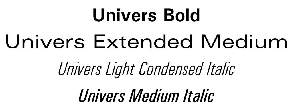
Font attributes are designated by a large variety of terms. Myfonts offers the Bodini typeface in 14 families each one with multiple fonts.
Basic Typography names can include normal or regular; bold and semibold; poster or black. Italics or oblique and narrow or condensed – all terms you may find in a type family. In addition there are combinations of these terms especially when a type family has numerous fonts. There are also typefaces tailored for special applications, such as mathematics.
The size of a font is measured in typographic units, the smallest of which is a point (abbreviated pt). One point is equal to 1/72 of an inch or 3.53 mm.
In manual typesetting, the point size originally referred to the height of the block of wood or metal not the character on its face. Today, most computer software still recognizes the glyphs bounding box as the height of the character. This is why different typefaces are not always the same visual height.
Type design is the art and craft of creating typefaces. Those who focus on this design specialty have a name for every part of the letterforms. To learn more about type design check out Fonts.com’s post “Anatomy of a Character“. There are designers who specialize in creating new typefaces and thousands of options are available now, both free and for purchase.
Main Typeface Categories
While some typographically oriented websites break down the fonts into many more categories for easy browsing, here we are going with the basics.
Within each of these categories, many of the typefaces contain a set of individual fonts for various weights, referring to the thickness of stroke; italics in each weight, and a variety of extra glyphs. Then there are those that are just the one set, no extra weights or styles.
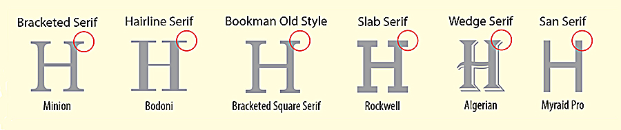
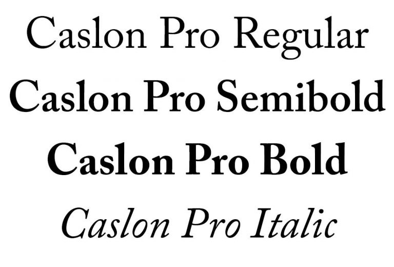
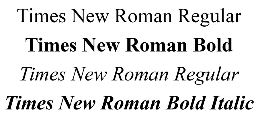
Serif: Tend to have finishing strokes, flared or tapering ends. Serif fonts are typically proportionately-spaced. They often display a greater variation between thick and thin strokes than fonts from the ‘sans-serif’ font family. Common serif typefaces include Bodoni, Caslon and Times New Roman (shown below).
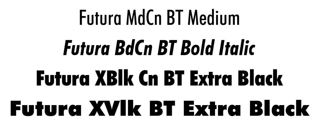
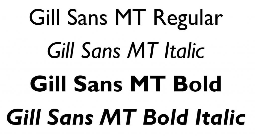
Sans serif: Tends to have stroke endings that are plain, squared – with little or no flaring, cross stroke, or other ornamentation. Sans-serif fonts are typically proportionately-spaced. They often have little variation between thick and thin strokes, compared to fonts from the ‘serif’ group. A few common sans serif typefaces are Futura, Univers, and Gill Sans (shown above).
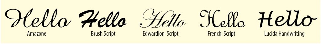
Script and Cursive: Generally have either joining strokes or other cursive characteristics beyond those of italic typefaces. The glyphs are partially or completely connected, and the result looks more like handwritten pen or brush writing than printed letter work.
This style of type is hard to read in all caps. Typefaces include Amazone, Brush Script, Edwardian Script, French Script and Lucida Handwriting (shown above).
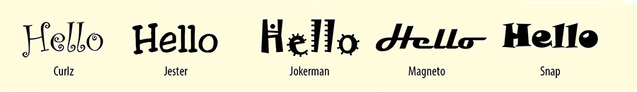
Decorative: This category includes stylized letters that may be visually linked to a specific group or timeframe. They can represent specific occasions and include novelty fonts.
The typefaces will contain representations of characters as opposed to picture fonts, which do not represent letterforms. The decorative typefaces shown above are Curlz, Jester, Jokerman, Magnato and Snap. These are a minuet sample of the options available.
Since picture fonts are not strictly typefaces, as you cannot combine them into words or sentences, they are not included in these categories, they are in a class all their own.
There are a lot of options for typefaces and the picto-fonts and the websites listed below are good places to start your search.
Quick Tips for Combining Fonts
These suggestions are guidelines for creating easily readable messages in your project. Get it right, and your design will become more dynamic. Get it wrong and there is discord and confusion.
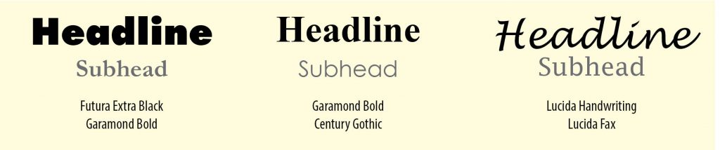
Use Type Families. Start with a variety of fonts within a single family. These fonts have been custom designed to work together and are therefore the safest method of varying your font without creating visual discord. Find a type family that has both serif and san serif for an classic combination that will always work together.
Think Contrast. When combining two fonts, go for contrast. Try pairing a serif with sans serif – a proven design standard.
If you mix two fonts that are very similar, the lack of contrast makes it looks like something is slightly off. Equally important, two very different fonts could be in danger of pulling the viewer in opposite directions. When combining two very different fonts establish a clear hierarchy between the two, the trick here is – complement or contrast, but never conflict.
Less is more. Two is best, three at most. In all but the most experienced hands, lots of different fonts wreak havoc on the cohesiveness of a design.
Be Appropriate. Let the message and audience play a big role in your font choice. If the content is modern and professional, stick to fonts that suggest these qualities.
Websites for Typefaces
There’s a diverse world of professional typefaces and a growing range of free options to choose from, here are some options to get you started.
Make Your Own Handwriting offers a free preview.
Identifont offers several options for searches, including appearance, name, similarity, picture, or designer/publisher.
My Fonts provides ‘What the font’. Upload a sample of a typeface you have seen in use and they give you a list of similar fonts in their database.
Dribble.com offers a blog on several on-line tools to find great type combinations for your design projects.
Free Font Websites
There are pages of offerings for free fonts on the internet, but first, a word of warning. Be diligent, before you download anything, check other sources to verify that others have used the site with no problems (ie free stuff is often not ‘free’). There are also many sites that sell typefaces in a wide range of qualities… i.e. often you get what you pay for. Some free fonts are from Type Designers who are just getting started or learning the craft. There are freebee’s that have issues with spacing or the letter forms.
The other thing to look for is whether a free font is listed as ‘ For Personal Use Only.’ Great to add to your collection for your own use, but I encourage not to use these fonts for any product you will be selling, type designers spend hours and hours perfecting each letter and deserve to be compensated for their creativity, technical abilities and time.
Good sites to visit for typefaces:
• Dafont offers a multitude of options and are either freeware, shareware, demo versions or public domain. Plus, has instructions on how to load into a computer.
• Font Squirrel They offer quality freeware that is licensed for commercial work.
• 1001 Fonts This site is not as pretty as other sites, but the quality is there. Browse an impressive collection of commercial free fonts that are easy to install.
Pinterest and typefaces
Another option for type and lettering is Pinterest, especially for hand drawn options and ideas. As a bit of a typo-holic, the Pinterest LKArts design assets board has a sub file called font faire. If you care to browse, there are lots of suggestions for other pinners for free fonts, specific uses, and successful typeface combinations.